Tag Archives: climate change

Top 3 Images for 2012: # 2 Hurricane Sandy

While the unprecedented retreat in summer Arctic sea ice extent was by far the most shocking event of 2012 in terms of climate risk, Hurricane Sandy (and the images of a flooded New York subway system) did more to raise consciousness with the general public. Bloomberg Businessweek summed up the sentiment nicely:

Hurricance Sandy JPG

From a scientific perspective, of course, you can’t actually say that Hurricane Sandy “was solely due to global warming stupid”. However, Continue reading

Top 3 Images for 2012: #1 Arctic Sea Ice Extent

1. Arctic Sea Ice Extent for Summer Melt Season

By far the most disturbing image of any I saw in 2012 was that for Arctic sea ice minimum summer extent. Indeed, the chart below is nothing short of shocking. Sea ice extent plummeted to 3.4 million square kilometres compared with the previous low of 4.2 million square kilometres in 2007, an 18% decline.

Arctic Sea Ice Extent

In the Intergovernmental Panel on Climate Change’s Assessment Report 4 published in 2007 we saw this statement: Continue reading

Technology: Singularity or Collapse? (Part 1: For Ever Exponential)

In the opening chapter of Ray Kurzweil‘s “The Singularity Is Near” we are presented with the following parable:

A lake owner wants to stay at home to tend to the lake’s fish and make certain that the lake itself will not become covered with lily pads, which are said to double their number every few days. Month after month, he patiently waits, yet only tiny patches of lily pads can be discerned, and they don’t seem to be expanding in any noticeable way. With the lily pads covering less than 1 percent of the lake, the owner figures that it’s safe to take a vacation and leaves with his family. When he returns a few weeks later, he’s shocked to discover that the entire lake has become covered with the pads, and his fish have perished. By doubling their number every few days, the last seven doublings were sufficient to extend the pads’ coverage to the entire lake. (Seven doublings extended their reach 128-fold.) This is the nature of exponential growth.

While ‘the water lily and the lake’ appears a strange choice of metaphor since if nothing else it highlights the importance of boundaries to growth, what Kurzweil was trying to communicate was how technology has barely begun to transform our lives.

By contrast, consider the 1972 report to the Club of Rome published under the title “The Limits to Growth.” Much maligned and mostly misrepresented, The Limits to Growth (LTG) was nothing more than a mathematical analysis of linear and exponential growth rates and ultimate constraints. According to the authors, the tyranny of exponential growth rates would eventually lead population and industrial production to explode, setting off a negative feedback in terms of burgeoning pollution and the eventual exhaustion of food and resources. The report never provided specific dates for the depletion of individual materials, although nine our of ten commentaries on the report claim it did (for a post I did on this particular urban legend, see here). Nonetheless, what the report did do was suggest that the idea of inevitable constant human progress was a dangerous myth. Continue reading

Climate Change, Boiling Frogs and Pearl Harbors

As we move further into 2012, media interest in climate change continues to decline. The chart below from  The Center for Science and Technology Research at the University of Colorado-Boulder shows a clear downward trend for world newspaper coverage. At the national level, a similar time series for US newspaper coverage can be found here and the UK here.

In my mind, media coverage of climate change is probably determined by four factors: 1) the setting of new temperature records, 2) visible iconic climate events, 3) media coverage of scientific studies that contain pessimistic forecasts of future climate and 4) extreme weather. Continue reading

The Conjoined Twins: Peak Oil and Climate Change

Of modern-day dystopias, the conjoined twins of climate change and peak oil energy (or rather peak energy) are poor dance partners, forever out of tune and stepping on one another’s toes. Despite being conjoined through carbon, the interaction between the two is complex and, at times, contradictory. Accordingly, while most of the environmental movement has embraced both issues, it is a somewhat awkward clinch.  At the most extreme, the thesis of one negates the other: a peak energy carbon constraint caps warming; while a carbon concucopia allows economies to grow head long into a climate crunch (that they may or may not have the wealth to cope with).

Peak oil’s path to respectability has been a little more convoluted than that of climate change.  Indeed, it is still quite far from becoming the consensus. Indeed, for peak oil theorists to emerge victorious they need to slay an even more entrenched existing consensus, that of neoclassical economics. Laurence Summers—a feted economist whose resume includes an academic professorship at Harvard, the role of Chief Economist at the World Bank and stints with both the Clinton and Obama administrations—had this to say about resource constraints back in 1991:

“There are no limits to the carrying capacity of the earth that are likely to bind any time in the foreseeable future. There isn’t a risk of an apocalypse due to global warming or anything else. The idea that we should put limits on growth because of some natural limit, is a profound error and one that, were it ever to prove influential, would have staggering social costs.” Continue reading

The Emissions Stories We Tell

In the climate change causation chain—from emissions, to greenhouse gas concentrations, to temperature change, to environmental impacts—the impacts are often the most difficult part of the chain to grasp. A major report by the UK Met Office Hadley Centre released at the beginning of December is, therefore, especially welcome, particularly as it incorporates 24 individual country studies (here) on climate impacts.

For the UK, the Met Office makes the following projection:

The UK is projected to experience temperature increases of up to around 3°C in the south and 2.5°C further north. The agreement between models is moderate in the south of the UK and low further north.

To start putting this in context, the 3C number above is by the year 2100 and is the change over the 30 year average for the 1960-1990 period (which is used as the baseline). For rainfall, we see this summary statement:

Europe shows a strong contrast in projected precipitation changes, with large decreases in the south and large increases in the north. The UK falls towards the northern region with generally increasing precipitation, with projected increases of up to 10%, though some southern parts of the UK may experience decreases of up to 5%. There is generally good agreement between ensemble members over the north of UK, but moderate agreement further south, indicating uncertainty in the position of the transition zone between increasing and decreasing precipitation over Europe.

The report then goes on to consider a number of sectors in turn: crop yields, food security, water stress and drought, pluvial flooding (rainfall saturation), fluvial flooding (river related), cyclones (extreme winds) and coastal impacts.

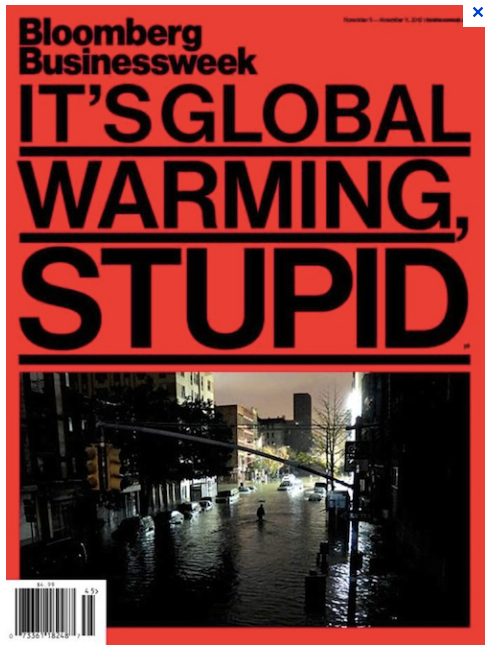
With such a broad spectrum of topics to choose from, a journalist covering the report has ample opportunity to push their own particular agendas. This headline from the Guardian:

Met Office warns of UK climate risks: Britain will experience water shortages and flooding by the end of the century if temperatures are left unchecked, analysis shows

And this from the Daily Mail:

Global warming would BOOST Britain’s farm crops by 10pc

While this blog occasionally focuses on the distorted press coverage of climate change, this is not a topic I want to pursue today. Overall, I am more interested in trying to understand the risks that climate change poses to individuals and their families. In this vein, not one newspaper deemed it necessary to mention the critical assumption the Met Office made: namely, the emission path underpinning their climate impact forecasts. Change this premise and you change the projection. Accordingly, the emission path used by the Met Office, which is clearly stated in the report summary, needs to be highlighted.

For the A1B emissions scenario the UK is projected to experience temperature increases of up to around 3°C in the south and 2.5°C further north.

So the projections given by the Met Office are premised on the world following the A1B emissions scenario; if the world doesn’t follow this scenario, the Met Office’s projections are invalid.

The A1B scenario came out of a report entitled the Special Report on Emissions Scenarios (SRES) published by the Intergovernmental Panel on Climate Change (IPCC) in 2000. These SRES scenarios formed the basis of the IPCC’s Third Assessment Report (TAR) published the same year and were also used for the Fourth Assessment Report (AR4) published in 2007. In reality, the scenarios are thought exercises. In the IPCC’s words:

Future greenhouse gas (GHG) emissions are the product of very complex dynamic systems, determined by driving forces such as demographic development, socio-economic development, and technological change. Their future evolution is highly uncertain. Scenarios are alternative images of how the future might unfold and are an appropriate tool with which to analyse how driving forces may influence future emission outcomes and to assess the associated uncertainties.

Indeed, the IPCC is so keen to disabuse us of the idea that the scenarios have any objective probability that they use the term ‘storylines’ (hence the title of this post):

Four different narrative storylines were developed to describe consistently the relationships between emission driving forces and their evolution and add context for the scenario quantification. Each storyline represents different demographic, social, economic, technological, and environmental developments, which may be viewed positively by some people and negatively by others.

The scenarios cover a wide range of the main demographic, economic, and technological driving forces of GHG and sulfur emissions2 and are representative of the literature. Each scenario represents a specific quantitative interpretation of one of four storylines. All the scenarios based on the same storyline constitute a scenario “family”.

If you are not familiar with the the IPCC’s scenario categories, then the ‘A’ scenarios are broadly fast growth while ‘B’ ones sacrifice some growth for environmental sustainability. Likewise the ‘1’ refers to a converging world, while ‘2’ sees lots of different developmental paths. This gives a matrix of four major families (or ‘storylines’ to use the IPCC’s wording) as depicted by the image below:

Simplistically, A1 is close to what we have seen over the last decade: the triumph of the so called Washington consensus model of rapid industrialisation, free markets and open borders; global capitalism reins supreme, and citizen-consumers realise their personal dreams through shopping at the mall. B1, by contrast, would be something like a sustainable nirvana: perhaps E.F. Schumacher’s ‘Small is Beautiful’ but with rich countries making sacrifices to lift up the living standards of poorer countries in the name of equity and fairness.

The four storylines are then further subdivided into more scenarios. Branching out from A1 are the three scenarios A1FI, A1B and A1T. The first is a fossil fuel intensive growth scenario, the second a balanced fossil fuel/renewable scenario and the last a renewables heavy scenario.

These divisions are then subdivided yet again to produce a grand total of 40 scenarios. Note that the designation HS means that all these particular scenarios share “harmonized” assumptions on global population, gross world product, and final energy. With the OS designation, such assumptions are relaxed within a particular model.

After that quick tour of the IPCC emissions scenario methodology, let’s return to the Met Office’s choice of the A1B scenario to be the basis of its climate impact analysis. Before we do, just note again that the IPCC bent over backwards not to emphasise one scenario when its report was issued back in 2000:

No judgment is offered in this Report as to the preference for any of the scenarios and they are not assigned probabilities of occurrence, neither must they be interpreted as policy recommendations.

In other words, you choose your scenario at your own peril. The report, however, does gives us some metrics to assess how particular scenarios are fairing as the years go by. The chart below shows the A1 (dash for global growth) emission scenarios. Rather counterintuitively, A1B (the balanced technology scenario) is initially a higher CO2 emitting scenario than A1FI (the fossil fuel intensive scenario). This is purely because of the particular models chosen for each scenario.

More important, the A1FI (the top dotted line) and A1B (the thick line) scenarios part company around 2020, with CO2 emission levelling off for the latter as wind, solar and such like comes on stream in mass. Looking at the predicted CO2 emission in 2050, we can see the divergence quite starkly in the table below (click for larger image).

In a similar manner, the table below (again click for larger image) shows an emerging difference between A1FI and A1B with respect to the reliance on coal and introduction of zero carbon renewables between 2020 and 2050:

So which path is more realistic? A1B or A1FI? Over the very near term, the two paths see nearly identical emissions, but it is worth just checking to see how actual emissions have been trending vis-a-vis the scenario paths projected by the IPCC back in 2000. The chart below is taken from a presentation by the Met Office’s Richard Betts at the ‘4 Degrees and Beyond‘ climate change conference held at Oxford University. If we update the chart with the advance estimate fossil fuel CO2 emission number for 2010, which is 9.1 giga tonnes of carbon, we can see that we are currently trending along the top of the IPCC’s overall band, but close to the A1B path.

Please note though that A1B in its early years is not really a  ‘balanced technology’ path as the renewables build-out has yet to take place. And, as noted before, because of some idiosyncrasies between the A1B and A1FI models, we are currently above the fossil fuel intensive A1FI path.

Against this background, fossil fuel emissions to date don’t really help us much in  deciding whether we will end up following the A1B balanced technology path or the A1FI fossil fuel intensive path.

The next question is whether we can calibrate the IPCC scenarios by using the highly detailed International Energy Agency (IEA) scenarios as presented each year in their flagship World Energy Outlook report (which I recently posted on here). The IEA has three main emission scenarios: the 450 Scenario, New Policies Scenario and Current Policies Scenario. The 450 Scenario is a thought exercise on what is needed to be done to keep the atmospheric concentration of CO2 below 450 parts per million. Unfortunately, renewable infrastructure build is not even coming close to this scenario path, so we can put it to one side.

The Current Policies Scenario is defined as follows:

WEO-2011 also presents updated projections for the Current Policies Scenario to show how the future might look on the basis of the perpetuation, without change, of the government policies and measures that had been enacted or adopted by mid-2011.

Note this includes policies that had been adopted but not executed as, for example, China’s 12th Five-Year Plan, which includes energy intensity targets.

By contrast, the New Policies Scenario includes a broader wish list of policies that countries have flagged but not necessarily done anything about:

The New Policies Scenario incorporates the broad policy commitments and plans that have been announced by countries around the world to tackle climate energy insecurity, climate change and local pollution, and other pressing energy related challenges, even where specific measures to implement these commitments have yet to be announced.

Keeping these definitions in mind, the IEA’s CO2 emissions projections under different scenarios go out as far as 2035. In that year, the IEA sees 36.4 giga tonnes (Gt) of CO2 being emitted under the New Policies Scenario and 43.3 Gt of CO2 under the Current Policies Scenario (under the 45o Scenario, emissions would be only 21.6 Gt, around a 40% fall from the 2009 level of 28.8 Gt of CO2). By contrast, the two IPCC scenarios, A1B and A1FI, have CO2 emissions moving above 40 Gt by 2020 (note to convert carbon emissions to CO2 emissions we have to multiply by 3.67), so in the early decades they are both high growth.

By 2035, the A1FI scenario is accelerating away from the A1B scenario, with emissions that year around 66 Gt of CO2 for the former against 55 Gt for the latter. The worst case IEA Current Policies Scenario has 43.3 Gt for that year.

The conclusion we can draw this far is that the selection of the A1B scenario by the Met Office for their climate impact study looks reasonable when we look out over the foreseeable time frame of 2011-2035 as covered by the IEA. However, as we go further into the future, is does become more of a ‘story’.

The IPCC sees emissions peaking under A1B at around 60 Gt somewhere around 2050, which is about double the current level of annual fossil fuel emissions. Others are less sanguine. Ross Garnaut, the well-know Australian economist published a paper (here) that suggests emission growth rates will outstrip even the IPCC’s A1FI scenario:

Accordingly, A1B could be viewed as quite conservative near term (emission overshoots unlikely) but quite aggressive long term (emission overshoots likely). In short, we would need to base our climate impact studies on a more negative emissions  scenario if we concur with Garnaut’s observations that 1) world GDP growth rates have continued to surprise on the upside and are likely to continue to do so and 2) key countries like China, India and Indonesia are being forced into an ever greater reliance on coal to meet their increasing energy needs, and will continue to do so.

At the same time, many of the trumpeted new technology hydrocarbon sources such as shale gas, shale oil and tar sands are not carbon emission friendly. They also suffer from  a particular Peak Oil community concern: we are having to use ever-larger amounts of energy to extract a given amount of energy as the easily accessible sources have become exhausted.

Personally, I think the Met Office would be wise to tell two stories based on the IEA’s Current Policies Scenario and one with the New Policies Scenario but with the latter extrapolated out for a world with high economic growth. Policy makers need an understanding of how bad things could get from a climate impacts perspective, and the use of A1B alone does not provide this. Stories are wonderful things, but they can sometimes be misleading—and ultimately dangerous—as well.

The Dystopian Dance

The issues of peak oil and climate change can both come across as having a certain millennial taint. Humanity, in its stupidity, is punished by nature. Or, as James Lovelock would put it, we are seeing the ‘Revenge of Gaia’. The Millennialists, however, see a happy ending at the other end of the tumult—at least for the chosen, enlightened few—while those of an atheistic or agnostic view of the world are condemned to a permanent descent into dystopia. No escaping ‘the end of days’ for them in a society under collapse.

Nonetheless, the fact that dystopias have frequently been the province of cranks does not mean they are not worthy of closer inspection. Prose writers have traditionally been the first ‘unto the breach’ when it comes to contemplating what the man (or woman) on the street deems unmentionable. Wells, Huxley, Orwell and Burgess come immediately to mind when we think of technological or political dystopias. Who having read Orwell’s ‘Animal Farm’ and ‘1984’ could not be a little more aware that a government (from any part of the spectrum) offering a political utopia may not instead transform our lives into a permanent dystopia.

Back in the 1970s, I read Nevil Shute’s ‘On the Beach’ and the completely abstract concept of a nuclear exchange had a little more meaning in one teenager’s mind.

With a novel, it is very difficult to throw the epithet ‘alarmist’; the writer is not telling us with certainty what will be but rather imagining what can be. And it is the description of a possibility that will alter our brain’s cognition of risk more than any number of reports from the Intergovernmental Panel on Climate Change report (as I touch on in my last post here).

To date Peak Oil has brought out better works of fiction than climate change (although usually climate change has a walk on part). James Howard Kunstler’s ‘World Made by Hand’ and ‘The Witch of Hebron’ both bring home in vivid colours the day-to-day struggles in a world with no easy access to cheap oil. Like many such works, though, there is a strong thread of the irrational. Religion (although not as we traditionally know it) and magic become a greater part of life’s mix in the author’s eyes, as a result of the failure of rationalism as embodied in science.

Kunstler is still somewhat a cult figure and has not acquired the literary fame of two other novelists that have dealt with dystopias head on: Cormac McCarthy and Margaret Atwood. The environmental campaigner and journalist  George Monbiot even had these words to say about McCarthy’s ‘The Road’:

“It could be the most important environmental book ever. It is a thought experiment that imagines a world without a biosphere, and shows that everything we value depends on the ecosystem.”

Both McCarthy’s ‘The Road’ and Atwood’s ‘The Year of the Flood’, however, start their stories after some unknown cataclysmic event. The reader may be left with a sense of unease, as was my teenage mind with Shute’s ‘On the Beach’, but an unease with what (with Shute I knew exactly)? Genetic engineering, global capitalism, advanced technology, pandemics, climate change? Tellingly, the publicity shot below from the movie ‘The Road’ has recently been wheeled out to accompany press articles on the potential impact of a euro break-up; the movie has become a generic metaphor for collapse, and climate change has to get in the queue.

Personally, I believe climate change has yet to find its Tolstoy. We see such luminaries from the world of science as Martin Rees openly contemplating the catastrophic potential of climate change, but this has had little resonance in the arts—or at least art that has caught the public’s imagination. Bill McKibben, the founder of the campaigning organisation 350.org, contrasts the situation with HIV, which produced “a staggering outpouring of art that, in turn, has had real political effect” (here). McKibben’s frustration is palpable:

Here’s the paradox: if the scientists are right, we’re living through the biggest thing that’s happened since human civilization emerged. One species, ours, has by itself in the course of a couple of generations managed to powerfully raise the temperature of an entire planet, to knock its most basic systems out of kilter. But oddly, though we know about it, we don’t know about it. It hasn’t registered in our gut; it isn’t part of our culture. Where are the books? The poems? The plays? The goddamn operas?

McKibben goes on to lists some of the reasons artists have not effectively engaged: diffuse perpetrators, disbursed victims, different time frames—in fact, a nightmare plot to narrate. But despite the difficulties, I believe that until we get the ‘goddamn operas’ communicators of climate chance science will have an uphill battle in changing people’s minds.

Do the Kids Care?

Climate change, if nothing else, is a time horizon risk: the longer you live, the more you are exposed to climate change and its impacts. Thus, to follow the logic, the old (and especially childless) should be less sensitive to climate change risk than the young. (For the different question of “Should the kids care?” see ‘Odds of Cooking the Kids’ here, here and here.) But do the young care?

survey last year suggests the young care a little less about climate change than anyone else. Continue reading

Back to that Big Number

In my post “A Big Number Gets Tweaked” I focused on ‘climate sensitivity’, aka the global mean surface temperature response to a doubling of CO2. It is an important number, and a basic understanding of what it means is a basic part of what I would call ‘climate change literacy’.

Going back to the Intergovernmental Panel on Climate Change (IPCC)’s Assessment Report 4 (AR4) published in 2007, a definition of climate sensitivity can be found on page 12 of the Summary for Policy Makers here.

The equilibrium climate sensitivity is a measure of the climate system response to sustained radiative forcing. It is not a projection but is defined as the global average surface warming following a doubling of carbon dioxide concentrations. It is likely to be in the range 2°C to 4.5°C with a best estimate of about 3°C, and is very unlikely to be less than 1.5°C. Values substantially higher than 4.5°C cannot be excluded, but agreement of models with observations is not as good for those values. Water vapour changes represent the largest feedback affecting climate sensitivity and are now better understood than in the TAR. Cloud feedbacks remain the largest source of uncertainty.

The chart below gives a sense of the different sensitivity estimates that provided the background to the IPCC’s final number:

This definition of climate sensitivity dates back to a landmark paper by Jule Charney et al in 1979 (here). In fact, to avoid confusion, we could call it Charney sensitivity. Now what Charney sensitivity isn’t (surprisingly) is the real world sensitivity of surface temperatures to a doubling of CO2. This is because Charney sensitivity was a blending of the results of two climate models that held a number of the variables constant. Of course, the Charney sensitivity in its modern version is now backed up by  a multitude of models of far greater sophistication, but interestingly the sensitivity number that came out of the 30-year old Charney report has held up pretty well. Nonetheless, the Charney sensitivity has a somewhat narrow definition. The excellent climate scientist run blog RealClimate (www.realclimate.org) explains this in more detail here:

The standard definition of climate sensitivity comes from the Charney Report in 1979, where the response was defined as that of an atmospheric model with fixed boundary conditions (ice sheets, vegetation, atmospheric composition) but variable ocean temperatures, to 2xCO2. This has become a standard model metric (because it is relatively easy to calculate. It is not however the same thing as what would really happen to the climate with 2xCO2, because of course, those ‘fixed’ factors would not stay fixed.

A wider definition is usually termed the Earth System sensitivity that allows all the fixed boundary conditions in the Charney definition to vary. As such, ice sheets, vegetation changes and atmospheric composition can provide feedbacks to temperature and thus cause a greater temperature response over the longer term. The Earth System sensitivity is in theory closer to the real world as it tells us at what temperature the system will ultimately get back to equilibrium.

The most influential calculation of Earth System sensitivity has been that made by NASA’s Jim Hansen, since it forms the scientific foundation for the 350.org climate change campaigning organisation. As the name suggests, 350.org urges humanity to strive toward a target of 350 parts per million (ppm) of CO2. The rationale for the target can be found here and rests heavily on a paper by Jim Hansen and his coauthors entitled “Target atmospheric CO2: Where should humanity aim?“.

In the abstract of the Hansen article, we immediately see a differentiation between a sensitivity that includes only fast feedback processes (a Charney sensitivity) and an equilibrium sensitivity that includes slower feedbacks (an Earth System sensitivity):

Paleoclimate data show that climate sensitivity is ~3°C for doubled CO2, including only fast feedback processes. Equilibrium sensitivity, including slower surface albedo feedbacks, is ~6°C for doubled CO2 for the range of climate states between glacial conditions and ice-free Antarctica. Decreasing CO2 was the main cause of a cooling trend that began 50 million years ago, the planet being nearly ice-free until CO2 fell to 450 ± 100 ppm; barring prompt policy changes, that critical level will be passed, in the opposite direction, within decades.

The paper then goes on to make a pretty forceful policy recommendation:

If humanity wishes to preserve a planet similar to that on which civilization developed and to which life on Earth is adapted, paleoclimate evidence and ongoing climate change suggest that CO2 will need to be reduced from its current 385 ppm to at most 350 ppm, but likely less than that.

Note that the article does contain a number of caveats over climate variability, climate models and other uncertainties. Further, as is the usual process in science, it has received various critiques, many suggesting that a figure of 6 degree Celsius is too high for long term sensitivity. What is not in dispute, however, is that, an Earth System sensitivity with long-term feedbacks will have a higher sensitivity number than a Charney sensitivity with only short-term feedbacks (almost by definition).

Despite this fact, we see numerous media reports getting tangled up between the two types of sensitivities following the publishing of the new Schmittner et al paper I talked about in a previous post. This from the Houston Chronicle:

To me, the real effect of this paper will be to really impair the credibility of the more extreme environmentalists who have been saying the planet faces certain doom from climate change.

I am thinking about such efforts as Bill McKibben’s 350 campain, in which he asserts that 350 ppm is the most important number in the world. Such environmentalists assert that the planet will warm as much as 6 Celsius degrees with a doubling of atmospheric carbon dioxide levels.

That’s a big number and doubtless would have catastrophic consequences for the planet. This is not in dispute. But scientists are now telling us this is not going to happen.

Well ‘no’ actually. Since we are comparing apples and pears, scientists are not now telling us that catastrophic outcomes are not going to happen.

Getting back to the topic of risk, we can now see how a better understanding of the different sensitivity concepts allows ordinary people to get a better idea of the climate risk they and their families face.

To reiterate, we are going from CO2, to temperature (via sensitivity) to impacts. To get a good idea of overall risk we need a sense of of how carbon emissions are trending; then we need a feeling for how sensitive temperature is to CO2; and lastly an understanding of how much the earth changes (and the impact on us of those changes) once the world warms.

The Charney sensitivity is very useful since it gives a floor to the kind of temperature changes we will experience. If the best estimate of this sensitivity number if found in the future to be smaller than the current consensus of 3 degrees, then that—other things being equal—is a positive thing. However, we are not in a position, yet, to reduce the consensus based on the Schmittner paper.

The Hansen 6 degree Celsius number is probably a little too high, but if we get anywhere close to this number, we are still in the bad lands of catastrophic climate change. Nonetheless, the time horizon for the full warming stretches generations into the future; thus, it is probably not the risk metric you would use if your concern only goes our as far out as grandchildren. But I think Jim Hansen receives a lot of underserved ridicule in certain parts of the blogosphere and American press for his championing of a number that implies the yet unborn have rights too.

Putting this question of human ethics to one side, those alive today are really interested in a Charney sensitivity plus alpha from a climate risk perspective. The components that make up that ‘plus alpha’ are a topic for another post.

The Daily Onion, FT and Climate Change Coverage

The Onion continues to mine climate change related news releases for its brand of biting satire. Here is a little piece they did in response to the sharp jump in carbon emissions in 2010 to a new record that I flagged in my last post.

And this on the disconnect between contemplation of the implications of climate change and actual action.

My all time favourite, though, is the article published by them in November 2010 with the headline: Global Warming Issue From 2 or 3 Years Ago May Still Be Problem.

The article captured beautifully the public and politicians’ inability to stay with the topic in the face of numerous other issues that have jockeyed for their time:

“Global warming, if you remember correctly, was the single greatest problem of our lifetime back in 2007 and the early part of 2008,” CGD president Nancy Birdsall said. “But then the debates over Social Security reform and the World Trade Center mosque came up, and the government had to shift its focus away from the dramatic rise in sea levels, the rapid spread of deadly infectious diseases, and the imminent destruction of our entire planet.”

Contrast and compare with an article by Simon Kuper titled “Climate Change: Who Cares Anymore” in the Financial Times Magazine.

Kuper highlights how the world has, in effect, grown bored with climate change and moved on despite the risks. As he puts it:

We journalists are dropping the topic too. It’s been a thrilling year for news, but the great absence on the news sites is climate change…… The environment bores readers.

And then moves on to look at the implications of neglecting the issue of climate change:

The question then becomes: what will happen? Nobody is sure. Almost all climate scientists think the outcome will be bad, perhaps catastrophic. They foresee more storms, droughts, floods and crop failures around the world, as Obama said in 2009 when he was still talking about these things.

But then we have an absolutely shocking passage confusing uncertainty with risk.

However, climate is far too complex a system to permit exact predictions. Nobody knows whether global temperatures will rise two degrees centigrade this century, nor whether that is the tipping point for catastrophe. When climate scientists make exact predictions, says Pielke, it’s usually a bid to focus the minds of politicians and voters. It hasn’t worked.

Well no actually, climate isn’t that complex to get a sense of risk (see my last three posts here, here and here). You can’t make an ‘exact prediction’ over whether a 60-a-day smoker will die from lung cancer thirty years hence. In fact, you only will know with certainty once he or she is dead—from lung cancer or other causes. But you do have a sense of probabilities and outcomes with a 60-a-day habit, and so it is with CO2.

Accordingly, the strategy that Kuper implicitly endorses makes no sense whatsoever.

Rich countries now have a semi-conscious plan: whatever happens, we’ll have the money to cope.

For we know what a world of 4 or 5 degrees Celsius of warming will bring since the earth has been there before. And we know the rough probabilities of whether we will reach 4 or 5 degrees of warming if we continue on our current emissions path.

Thus it is really The Onion, and its spoof climatologist Helen Marcus, that gets the reporting right, with a final paragraph in their piece that should make you laugh—if it doesn’t make you cry:

“Climate change is real, and we are killing our planet more every day,” said climatologist Helen Marcus, who has made similar statements in interviews in 1994, 1995, 1996, 1997, 1998, 1999, 2000, 2001, 2002, 2003, 2004, 2005, 2006, 2007, 2008, 2009, and 2010. “We need to make a serious effort to stop it, or, you know, we’ll all die. There really isn’t much else to say.”